Vodka Bottle Design Trends for Export Brands
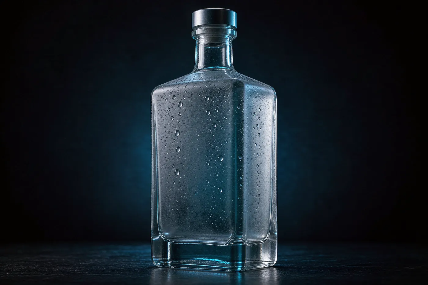
Vodka is sold on purity, which is why almost every bottle in the category is clear. That constraint pushes differentiation into texture, weight and print quality rather than colour.
What is trending
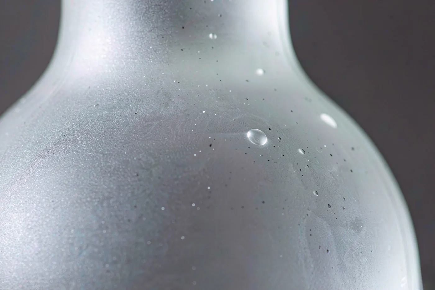
- Frosted and etched surfaces — matte finishes that signal premium without hiding the liquid.
- Heavy bases — mass at the bottom of the bottle to raise perceived value.
- Deep embossing — logos and crests moulded into the glass.
- Minimal labels — letting the glass and print do the work.
- Textured panels — tactile areas that catch the hand.
Working within the clarity constraint
Because flint glass transmits the full spectrum, vodka bottles get no ultraviolet protection from the glass itself. In practice that is acceptable for plain vodka, which is chemically stable, but it does matter for:
- Flavoured vodkas with natural colour.
- Botanical or citrus infusions.
- Cream and dessert styles.
If the formula falls into those categories, specify amber or a UV-absorbing coating and confirm it with the supplier.
Shape families that work
- Tall cylinder — contemporary, efficient to pack.
- Soft square — large label panel, tight pallet fit.
- Tapered flagon — heritage cues.
- Faceted apothecary — light-catching shelf presence.
Closures
- ROPP aluminium — standard, cheap, tamper-evident.
- Bar-top stoppers — premium expressions.
- Screw necks with pourer compatibility — important for on-trip sales.
Common mistakes
- Specifying a heavy base without checking the capping line's top-load limit.
- Choosing a closure after the mould is cut.
- Approving artwork from a render instead of a physical sample.
- Ignoring scuff testing on coated bottles.
The clarity constraint and how to work with it
Vodka is marketed on purity, and clarity is the visual proof. That effectively rules out coloured glass for most of the category, which removes the easiest differentiation lever.
The consequence is that differentiation moves to three places:
- Texture — frosting, etching and embossed detail.
- Weight and proportion — heavy bases and unusual shoulder lines.
- Print quality — metallics, high-register detail and minimal layouts.
Brands that fight the clarity constraint usually lose. The ones that accept it and invest in surface and proportion win the shelf.
Structural options that survive the constraint
- Deep punt and thick-appearance base — delivers presence without abandoning a flint bottle.
- Faceted or geometric bodies — catch light without adding colour.
- Long, slim necks with a heavy finish — read premium at close range.
All three are mould decisions, which means they need to be made before tooling.
Closure and finishing notes
- ROPP aluminium with tamper-evident band is the category default and the cheapest premium-looking option.
- Bar-top stoppers appear at the premium end, particularly for gift formats.
- Metallic and pearlescent coatings are common; confirm abrasion resistance.
Because the bottle is clear, the closure often carries the only colour on the pack. It is worth spending on.
Common mistakes
- Using coloured glass and losing the purity cue.
- Over-decorating — heavy print fights the minimal identity the category expects.
- Ignoring scuffing on frosted surfaces, which is the most common in-market complaint.
- Choosing the closure last, then finding the bore does not match the mould.
Decoration that survives the freezer
Vodka is the one spirits category routinely stored below zero. That single fact eliminates several decoration options that work fine elsewhere.
- Adhesion drops at low temperature. Adhesives and some coatings become brittle, so labels and prints that pass a room-temperature test can lift or crack after freezer storage.
- Condensation is the real enemy. A bottle taken from a freezer into a warm room wets out immediately. Water-based inks and some papers degrade under repeated wet-dry cycling.
- Frosting hides the problem and creates another. Frosted glass looks consistent when wet, which is a plus, but it also shows fingerprints and scuffing more readily.
Specify a freeze-thaw adhesion test as part of sample approval. It takes days, not weeks, and it prevents the most common in-market complaint in this category.
Weight, freight and the price war
Vodka competes on price more than most spirits, which pushes the packaging budget down while the expectation of premium presence stays high. The resolution is almost always a heavy-looking base on a lighter bottle.
Two things to hold on to:
- The base is what the buyer sees. A deep punt and a thick-appearing base carry the perception at a fraction of the glass cost.
- Freight is a per-container cost. On a low-margin, high-volume product, removing even 15 percent of glass mass can matter more than a small unit-price concession.
Specification checklist for vodka
- Confirm flint clarity expectations with a physical reference sample under retail lighting.
- Approve decoration after freeze-thaw testing, not before.
- Confirm top-load strength if the bottle is being lightweighted.
- Check closure liner compatibility at the actual ABV.
Texture as the primary differentiator
Where colour is unavailable and print budget is tight, texture carries the identity:
- Full or partial frosting — the most common vodka treatment, and the one buyers associate most directly with the category.
- Embossed geometry — facets, fluting or a banded shoulder that catches light without adding colour.
- Contrast finishes — a frosted body with a polished panel gives a printable flat area and a tactile one.
Confirm frosting durability early. It is the most visually effective treatment in the category and the most likely to show handling damage.
Closure and capsule on a clear bottle
Because the bottle itself carries no colour, the closure does the visual work:
- A metallic ROPP shell is the standard and gives a clean, consistent finish at low cost.
- Bar-top stoppers read premium and suit gift formats, but add a station and a component cost.
- Capsules and sleeves are the usual place a mismatch shows, because they sit against the neck in a different material.
Approve the closure, capsule and any print together on one physical bottle. Approving them separately is how a launch ships with a visible neck seam.
Key takeaways
- Vodka is sold on purity, and clarity is the visual proof - coloured glass usually contradicts the category.
- Differentiation therefore moves to texture, weight and print quality.
- Freezer storage is a real constraint on adhesives, inks and coatings.
- ROPP with a tamper-evident band is the category default and the cheapest premium-looking option.
- Because the bottle is clear, the closure often carries the only colour on the pack.
- Over-decorating fights the minimal identity the category expects.
Frequently Asked Questions
Why are most vodka bottles clear?
Vodka is sold on purity, and clarity is the visual proof. A flint bottle lets the buyer check for haze or particles before reading the label, and it lets light through the liquid in a way that reads as clean rather than dull. That is worth more to the category than UV protection.
Do vodka bottles need UV protection?
Plain vodka is among the most light-stable spirits, so flint is standard and protection is rarely needed. Flavoured or botanically infused vodkas are more sensitive, because colour and aroma compounds can degrade, and those expressions may warrant amber glass or a UV-blocking coating.
What bottle weight suits a premium vodka?
Heavier glass reads premium, but the useful target is the heaviest bottle your price tier and distribution chain can carry without breaking the landed cost. Confirm top-load strength for the capping line regardless of weight, because a heavy bottle with a weak finish will still fail.
Which closure is standard for vodka?
ROPP aluminium is the category default, particularly with a tamper-evident band, because it reads as clean and neutral and applies quickly on high-speed lines. Premium expressions sometimes move to a bar-top stopper, but the closure then becomes a design statement rather than a default.
How important is texture on vodka bottles?
Very. Because the clarity expectation limits how much colour a vodka bottle can carry, brands differentiate through surface instead: frosting, etching, embossed detail and soft-touch coatings. Texture also gives the hand something to register on a shelf where the bottle is otherwise transparent.
Related
- Whisky Bottle Shapes and Sizes: A Buyer's Guide
- Gin Bottle Styles: From Apothecary to Modern Minimalist
- Glass Bottle Colour and UV Protection: Flint, Amber, Green and Coated
Written by Eric Jiang, Glass Packaging Engineer, 12 years.