Gin Bottle Styles: From Apothecary to Modern Minimalist
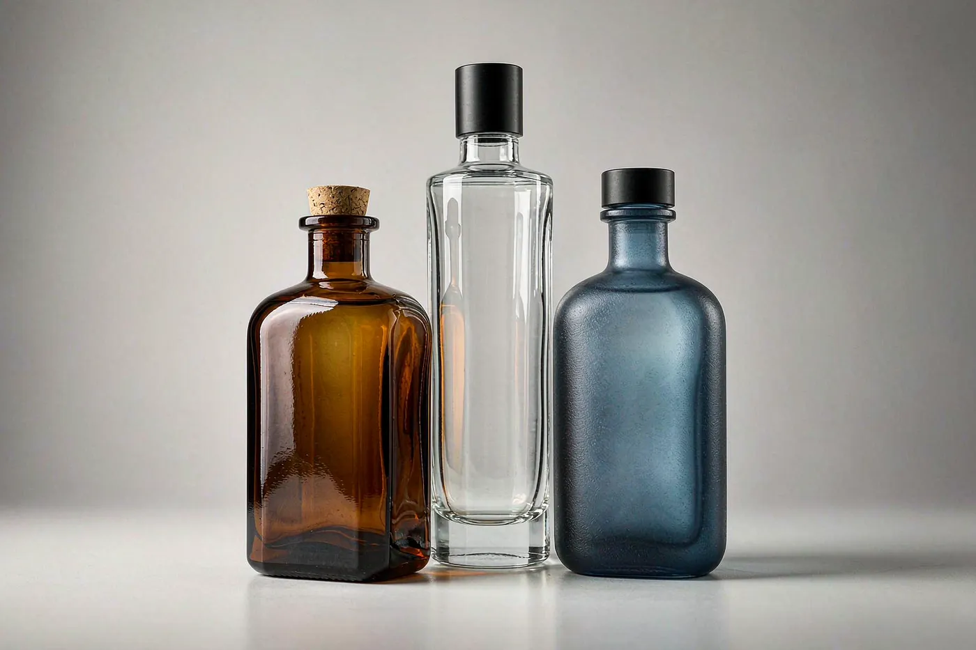
Gin is the most design-led category in spirits. Because the liquid is usually clear and the flavour story is botanical, most of the differentiation lands on the glass: shape, colour, texture and print. Vodka competes on minimalism; gin competes on character.
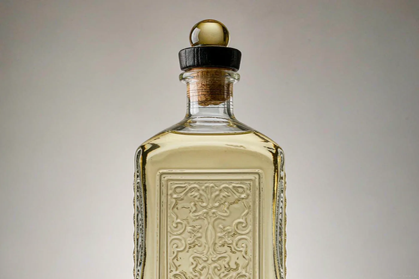
The main gin bottle styles
- Apothecary — squat, faceted or shouldered, short neck. Reads heritage, pharmacy, craft.
- Modern minimalist — tall, clean cylinder or soft-square, minimal labelling. Reads contemporary and premium.
- Ceramic-look — opaque coated bottles, often matte. Reads luxury and giftable.
- Frosted — acid-etched or sandblasted surface. Reads soft, tactile, premium.
- Decanter style — sculptural with a stopper. Reads limited edition.
Shape and shelf read
- Tall and slim — premium, elegant, but needs a stable base and careful pallet design.
- Squat and wide — solid, traditional, efficient shipping density.
- Square panels — the largest clean label area and the tightest pallet fit.
- Faceted — catches light on shelf, but higher tooling complexity.
Colour decisions for gin
- Flint — the default. Best for showing clarity and any natural tint from botanicals.
- Amber — used for barrel-rested or navy-strength expressions where protection matters.
- Blue and cobalt — a strong differentiation signal in a crowded clear-bottle category.
- Coated and frosted — colour without changing the glass batch, at the cost of some scuff resistance.
If the gin has visible botanicals or a natural hue, remember that flint transmits the full spectrum and offers no UV protection. A sleeve or coating is the usual compromise.
Closures for gin
- ROPP aluminium — the mainstream choice, cheap, tamper-evident, fast on the line.
- Bar-top stoppers — premium and giftable, especially for limited editions.
- Cork with a wooden or zamac head — the classic premium cue.
- Pourer-compatible screw necks — worth specifying if the brand sells into on-trade, since a 28 mm GPI screw neck accepts the widest range of pourers.
Decoration that works on gin
- Screen printing — crisp detail directly on the glass, good for crisp typography.
- Acid etching — matte botanical motifs; very durable because it is in the surface.
- Decals — full-colour artwork, including gradients.
- Embossing — permanent and tactile, ideal for a crest or monogram.
- Spray coating — full-body colour, including gradients.
Practical sourcing notes
- Confirm the finish code and T dimension tolerance before ordering closures.
- Approve a physical sample from the actual mould, not a rendering.
- Check fill tolerance against your filler: plus or minus 2.0 percent for 376 to 999 mL under TTB's gauging manual.
- Validate decorated surfaces for scuffing in real transit conditions.
Why gin bottles carry more decoration
Gin competes on botanical story and on shelf distinctiveness, and both are carried by decoration rather than by glass mass. The category therefore rewards:
- Textured surfaces — frosting and etching that suggest craft and read well under bar lighting.
- Detailed illustration — botanical artwork, which is a print job rather than a mould job.
- Colour through coating — a wide palette on a flint base, because gin has no strong colour convention of its own.
This is the category where a stock mould plus strong decoration performs closest to a custom shape.
Shape families and what they signal
- Apothecary and medicine-style — heritage, craft, small batch.
- Tall and slim — contemporary, bar-led, often with a long neck.
- Wide-shouldered and squat — premium, weight-led, closer to whisky cues.
The shoulder line does most of the work. It is the first thing a buyer reads at shelf distance.
Practical constraints
- Frosted surfaces show fingerprints and scuffing more readily than bare glass. Test handling before committing.
- Fine illustration needs print registration quality. Approve on a physical sample, not a proof.
- Coated bottles can change surface friction, which matters on high-speed lines.
None of these rule the effect out. They are reasons to approve on production samples.
Sourcing notes
- Gin sells in 700 ml for the EU and 750 ml for the US; run them as separate SKUs.
- Bar-top is the premium default, but ROPP is widely accepted and cheaper.
- Decoration setup cost per colour is the main lever on short runs — reduce colours before reducing quality.
Bar-back visibility
A significant share of gin is poured in bars, where the bottle sits on a back shelf under warm, often dim lighting and is seen from several metres away.
- Silhouette carries at distance. A distinctive shoulder or neck reads further than any print.
- Warm light flattens colour. Coatings that look saturated under retail LED can go muddy under bar lighting.
- Texture catches what light there is. Frosting and faceting pick up highlights that print cannot.
Assess a gin bottle under both retail and warm bar lighting before approval. They rarely flatter the same bottle equally.
Limited editions and variant strategy
Gin brands release variants more frequently than most categories, which makes tooling economics different:
- Keep the core SKU on one shape and differentiate variants through coating and print rather than new steel.
- Use the same finish across the range, so one closure specification serves every variant.
- Plan the variant calendar around setup costs, since print setup is charged per design.
The result is a range that looks broad on shelf without a mould programme to match.
Print and coating on gin
Gin carries more printed detail than most spirits categories, which makes print specification the practical constraint:
- Registration tolerance — fine botanical illustration exposes registration problems that a simple layout would hide.
- Coating under print — a coated base changes ink adhesion and, in some systems, firing behaviour.
- Abrasion on the shoulder — the region most likely to be handled and scuffed in bar service.
Confirm the coating and print system together, on one production sample, rather than approving them separately.
Weight, price tier and category norms
Gin sits between vodka and whisky on weight expectations:
- Standard tier — lightweight to mid-weight, often with heavy decoration to compensate.
- Premium tier — a heavier base and a distinctive shoulder carry the perception.
- Super-premium — weight plus a textured or coated surface, usually with a bar-top closure.
Unlike vodka, gin tolerates heavier glass without contradicting the category story, which gives more room to use weight as a signal. The risk is over-specifying weight and losing the price point.
Key takeaways
- Gin competes on botanical story, which is carried by decoration rather than glass mass.
- The shoulder line does most of the work at shelf distance.
- Bar-back visibility is a real constraint: warm, dim lighting and two metres of viewing distance.
- Frosting shows fingerprints and scuffing - test handling before committing.
- Keep one core shape and differentiate variants through coating and print.
- Confirm coating and print as one system on a production sample.
Frequently Asked Questions
Why are gin bottles often clear?
Clarity is part of the category's proposition. Buyers read a clean, bright liquid as a quality signal, and a clear bottle lets them check it before reading the label. Flint glass dominates gin despite offering no UV protection, which is why botanically heavy or coloured gins often move to amber or a coating.
What is an apothecary gin bottle?
A squat, often faceted bottle with a short neck and a wide shoulder, echoing nineteenth-century medicine and pharmacy bottles. It carries heritage and craft cues, and it gives a large front panel for a botanical-led label. The shape also sits well on a back bar.
Do gin bottles need UV protection?
Less urgently than liqueurs, because clear gin is not usually colour-critical, but botanical extracts and any added colour can still fade under strong retail lighting. If the gin is brightly coloured or heavily botanical, amber glass or a UV-blocking coating is the safer specification.
Which closure suits gin?
ROPP aluminium is the practical choice for mainstream and high-turn lines, because it is cheap, tamper-evident and fast to apply. Bar-top stoppers with wooden or synthetic heads suit premium and gifting expressions, where the opening experience is part of the brand. Match the finish to the closure before tooling.
How do gin bottles differ from vodka bottles?
Gin leans towards decorative, botanical and heritage cues: coloured glass, apothecary shapes, heavy embossing and textured labels. Vodka leans towards minimalism and surface texture, usually in flint glass. That changes the glass colour, the mould detail and the decoration budget, not just the label.
Related
- Whisky Bottle Shapes and Sizes: A Buyer's Guide
- Vodka Bottle Design Trends for Export Brands
- Custom Glass Bottle Decoration: Embossing, Etching, Coating and Printing
Written by Eric Jiang, Glass Packaging Engineer, 12 years.